Summary
WP Engine was to release an online publication with content for the digital marketer. In their words:
Velocitize informs, educates, and inspires digital marketers and agencies by offering strategic insights tied to open source for and by industry experts.
Strategy
The site would be visited by a large audience with various levels of expertise in the digital marketing realm. So, while it needed to feel somewhat cutting edge, it primarily needed to be intuitive and functional.
Implementation
Working with managing editor Marie Dodson, we decided to limit the number of categories an article must fit within and use them for the primary navigation. Then I positioned the articles into a familiar grid pattern, peppered with simple hover effects.
Home page
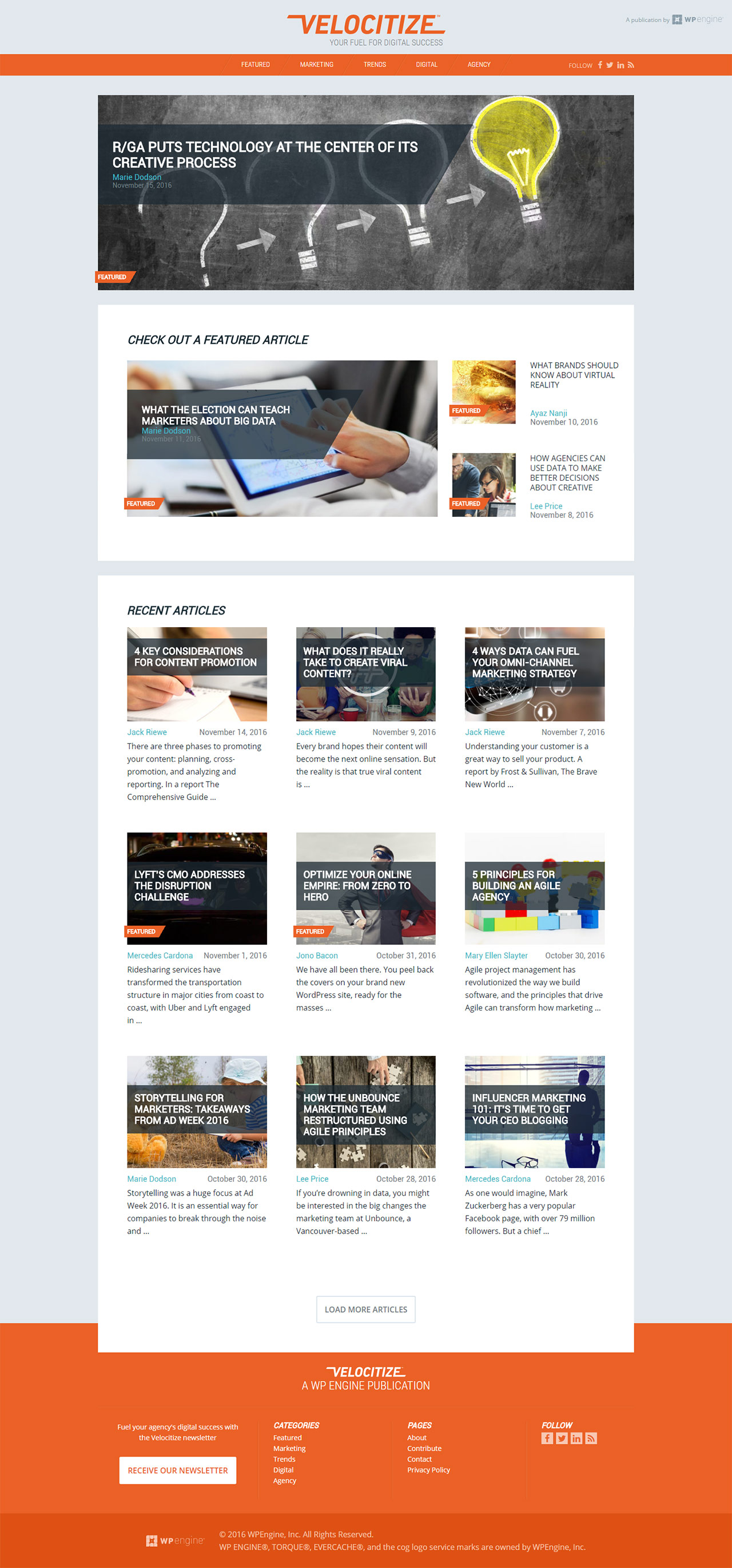
Showcasing featured articles as well as the most recent ones, the homepage is a great place to get the latest trends Velocitize is reporting on.

Single post page
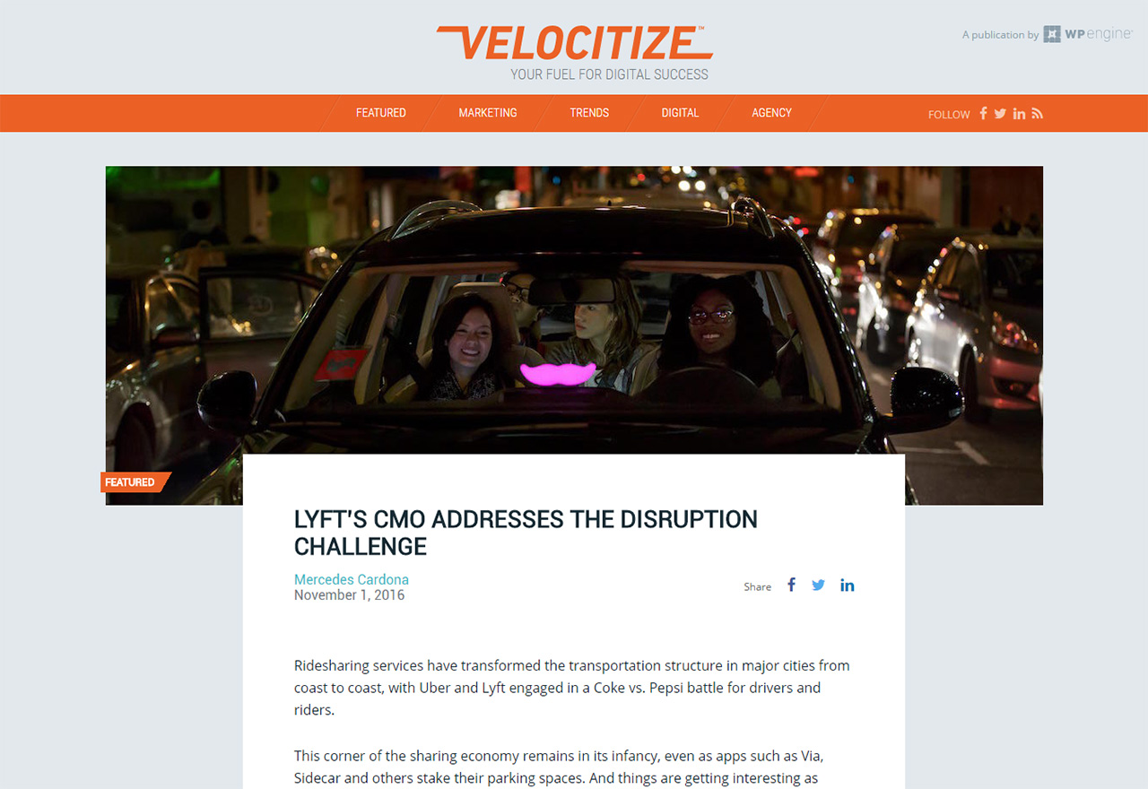
The content of each article overlaps onto the large hero image. This creates a bit of depth and provides a visual cue to draw the user's eyes into the article.

Logo slide detail
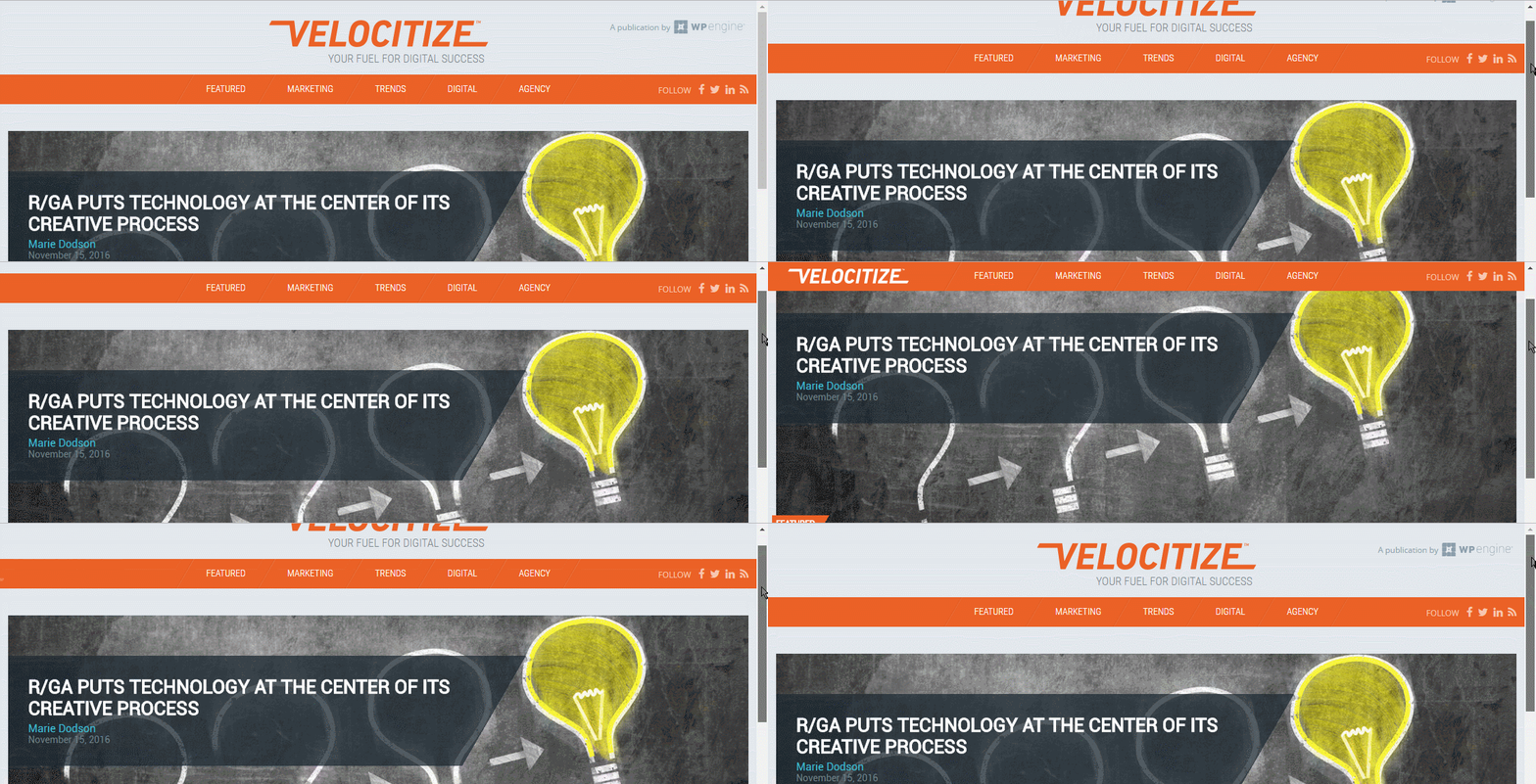
The logo slides in from the side when the user scrolls down the page, then it slides back out when going back to the top. This acts as a subtle reminder of the name of the website, which was a goal for this new brand.

Newsletter detail
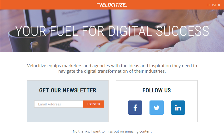
Users can register for the newsletter via a self-triggered popup on any page of the site.

Results
Velocitize has quickly grown to over 80 articles in its first year, and its readership continues to expand.