Product owner, Design, Development
The simplest way to move contacts
An Itch Worth Scratching?
The story of Contact Mover revolves around Immense Networks, who brings value to other companies as their outsourced IT department. They identified a recurring pain point—moving new employees’ contacts from another Exchange server to their own; the steps involved were ridiculous.
People loved their BlackBerrys back then, iPhone was gaining traction, Windows Mobile was still acceptable, and few in the corporate world cared about Android. The problem was that Active Sync was implemented differently, so moving contacts was a nightmare.
“Build a tool that quickly and reliably transfers Exchange contacts”
Surely, other IT firms were experiencing this problem and wasting just as much time. While future sales was a pipe dream, the initial goal became clear.
First to market

Developer of v1.0
I worked with developer Andrew Frederick on the first version of Contact Mover. We made it utilitarian and focused on tech industry professionals.
We decided that iOS had the best compatibility for syncing with various Active Sync implementations (even better than Windows Mobile); bonus points for the fact that Immense could sell it to their own clients through the App Store.
Fast, functional design
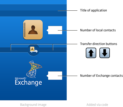
As with any app icon, I wanted it to scream what the app did without text. I created a moving truck carrying the current iOS Contacts App icon (the silhouette is developer Andrew).
Most of the interface is a background image, reducing development time. Andrew positioned how many contacts were in each account (Exchange and Local), and he slapped 2 arrow buttons for the user to decide which way to move the contacts. This interface did not require any textual instructions, which was nice because that iPhone 3G screen was the size of a Tamagotchi.

A simple, easily-understood interface was paramount for v1.0
Workflow in need
When feedback became less about bugs and more about improving the workflow, I knew the app was going somewhere. And they were right; version 1 required users to toggle between Settings and Contact Mover a few times.
The workflow went like this:
- 1 Ensure only the old Exchange account is enabled
- 2 Open Contact Mover and transfer contacts upwards into local Contacts
- 3 Disable the old Exchange account and enable the new one
- 4 Back in Contact Mover, transfer contacts downwards into the new Exchange account
Contact Mover had been available for 2 years at this point, so we decided to expand who it could benefit. This would require a simplistic interface and support more account types (Gmail, Hotmail, iCloud, and so forth).
Forget Active Sync support—it should allow the average user to move contacts between nearly any 2 accounts.
Making Contact Mover better

Developer of v2.0
I worked with developer Christopher McKnight on version 2 of Contact Mover. I envisioned giving users the most helpful interface possible with the fewest number of choices.
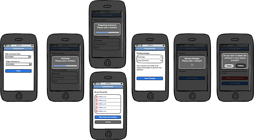
The new workflow would go like this:
- 1 Choose which accounts to move contacts from and to
- 2 Scan for potential errors and notify user if there are problems
- 3 Allow user to perform the transfer

Redesigning Contact Mover
I believe my original icon concept was successful, and that legacy should simply be updated for version 2. The new icon would be inspired by iOS 7 and reference the updated Contacts app. And I’d finally give Contact Mover an identity, complete with a nifty purple color scheme.
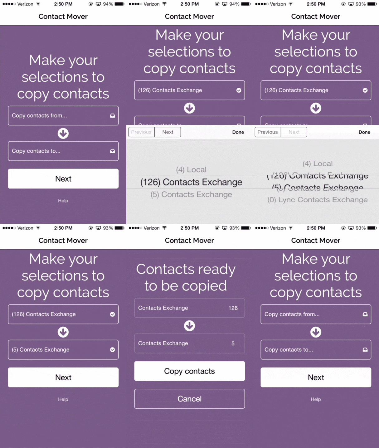
Version 2 requires the user to choose source and destination address books. Instructions are large and concise, select fields are practically big enough to hit with elbows, and clicking the Next button is the obvious goal on the page.

Now, most users can transfer contacts without leaving the application
Marketing website
I wrote user stories to identify potential questions about the app:
- » How does it work?
- » What accounts is it compatible with?
- » How much is it?
- » What can't it do?
- » Who built it?
- » Who can I complain to?
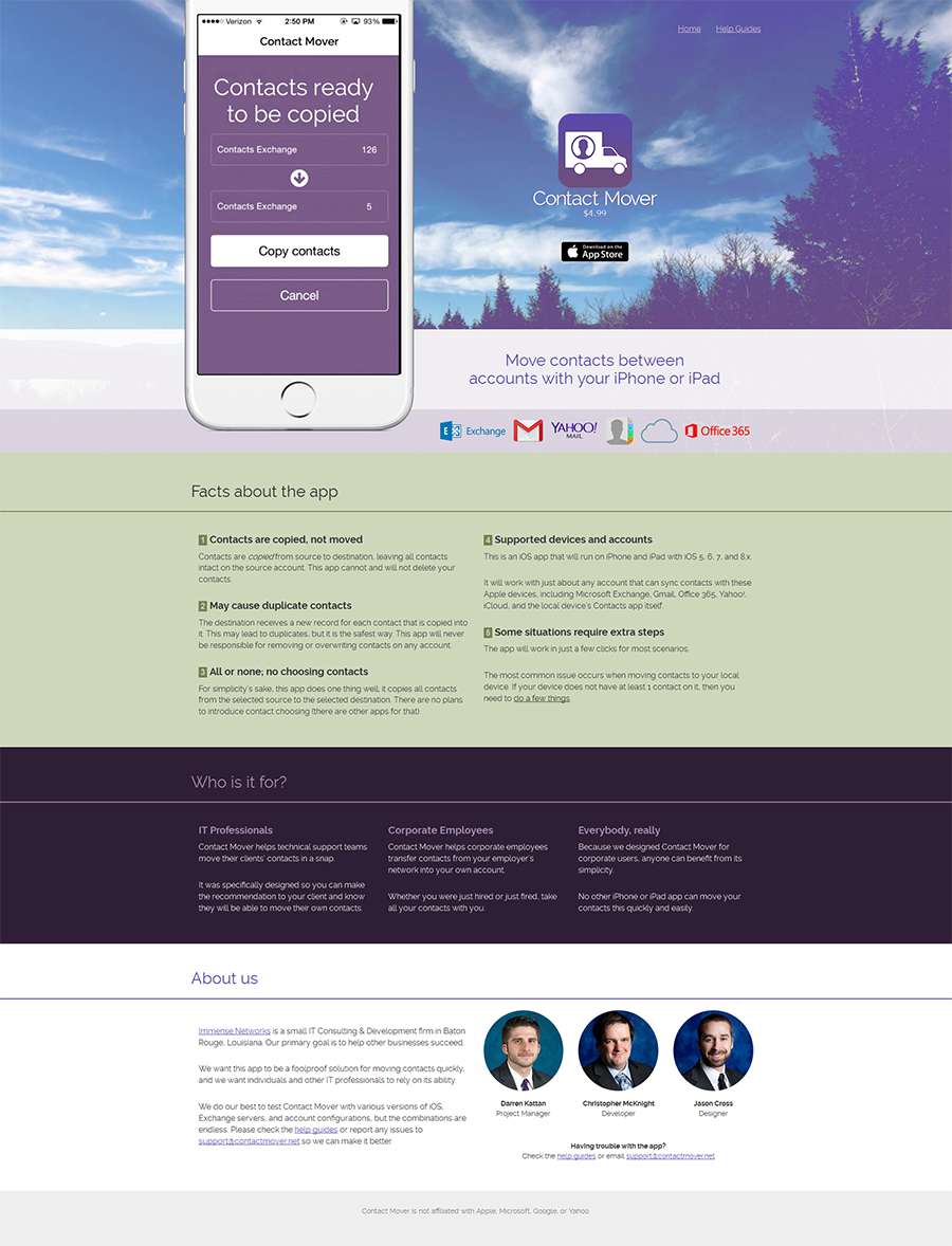
I wanted the public site to explain the passion behind Contact Mover's existence, that it was built by a small IT firm to help other IT firms. The site should also fully explain the value for the price tag.
I prototyped, designed, wrote content, and developed it onto Middleman.

What I learned
I welcomed insight from Immense's IT team to help me fully understand Contact Mover's purpose.
I learned the importance of appropriately allocating resources when building a new product that could fail.
We created Contact Mover to solve a specific internal problem in mid 2011, and that evolved into a more realized solution that continuously helps hundreds of people each month now in 2015.
It was an iterative process that initially stressed utilitarian functionality above all else. That foundation allowed me to explore simple avenues to achieve new goals while remaining loyal to the product’s legacy.